In luxury hospitality, every guest touchpoint is a branding opportunity. The keycard presented at check-in is one of the first physical objects a guest handles — and often the object they carry most frequently throughout their stay. A well-designed keycard reinforces brand positioning, creates a sense of arrival, and can even become a collectible souvenir. A poorly designed one undermines the entire guest experience.
Design Principles
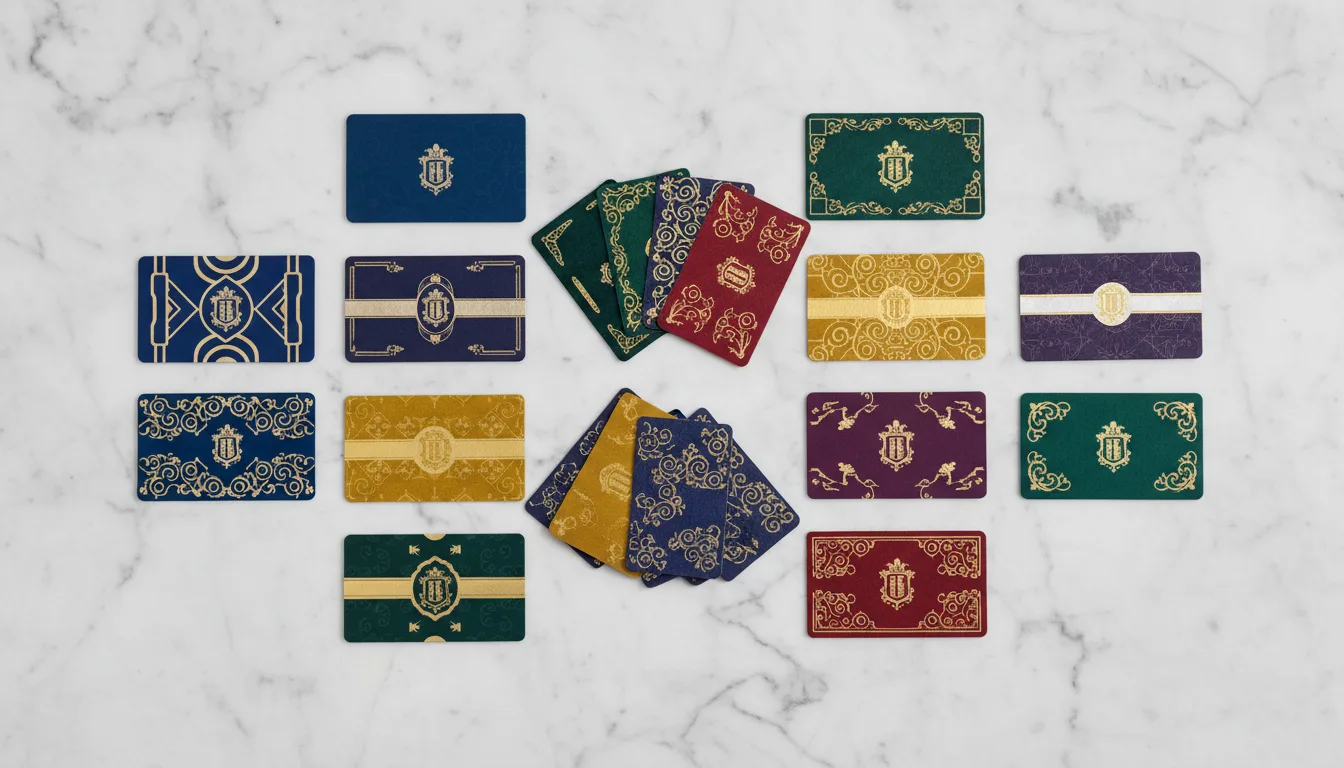
Less is more: Premium keycards favour clean, minimal designs with generous white space. Avoid cluttering the card with excessive text, multiple logos, or promotional messages. The most elegant cards feature a single brand mark, a subtle texture, and a premium finish.
Brand alignment: Colour palette, typography, and imagery should match your property's visual identity precisely. Request Pantone colour matching from your printer for brand-critical colours — CMYK approximations may not match.
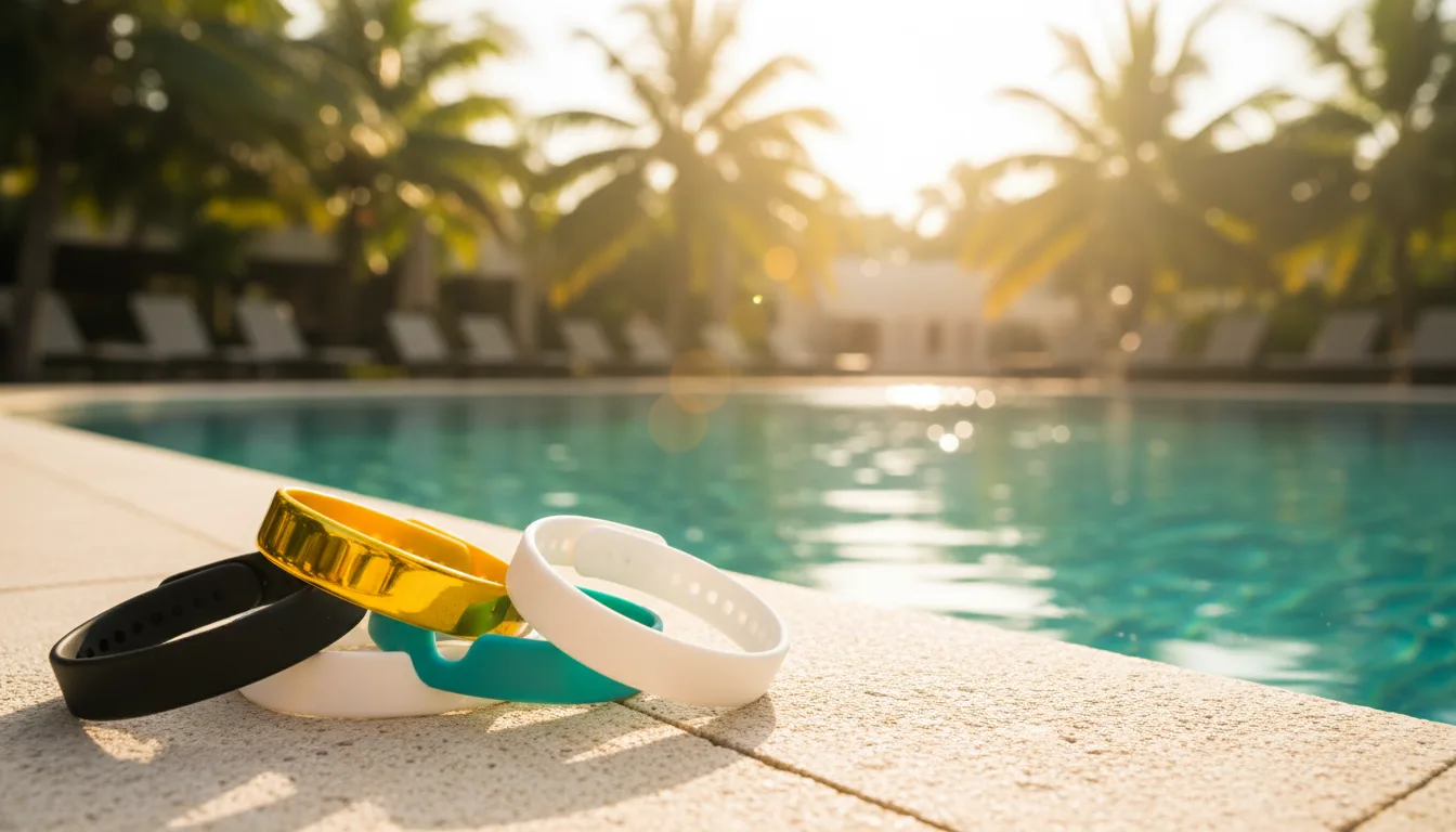
Tactile quality: The feel of a card matters as much as how it looks. Matte lamination conveys sophistication, while spot UV varnish on the logo creates a contrast between matte and gloss that guests can feel.
Premium Finishing Techniques
- Metallic foil stamping: Gold, silver, or copper foil applied via heat transfer. Creates a luminous, reflective logo or border that immediately signals luxury.
- Embossing and debossing: Raised or recessed elements add a three-dimensional tactile quality.
- Spot UV varnish: Selective glossy coating over matte lamination creates visual and textural contrast.
- Edge colouring: Painting the card edges in gold, silver, or a brand colour adds a premium detail visible when the card is held at an angle.
Practical Considerations
Design artwork should account for the keycard's technical requirements: leave a safe zone around the embedded RFID antenna (typically a 5mm border), position critical design elements away from the chip location, and ensure barcode or magnetic stripe areas remain clear. Always request a physical proof before committing to a large print run.